From the 12 Basic Principles Of Animation, which includes:
1. Squash and stretch
2. Anticipation
3. Staging
4. Straight Ahead Action and Pose to Pose
5. Follow Through and Overlapping Action
6. Slow In and Slow Out
7. Arcs
8. Secondary Action
9. Timing
10. Exaggeration
11. Solid Drawing
12. Appeal
The 2 types I will personally go for (which also relates to my style), will be both 'Exaggeration' and 'Appeal', because my style (trying to approach an 'anime' style) uses exaggeration in order to express the characteristics of the characters. This is the style I like to exploit in. As characterisation are important as well as storyline. Not only that, 'exaggeration' intends to reveal more emotions and feelings of characters in an animation. And that is a very good principle when grasping viewers attentions and provide feelings for an animation.
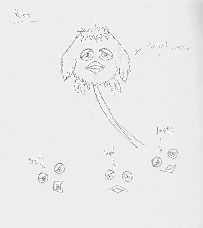
Appeal is another style in which I would use because the character 'Poro' is suppose to be a loveable and cute character. Even though it is only a scenario, I wanted Poro to be as cute as possible, hence a furry cute creature. However, for Kace, more character analysis is needed to make him a more 'appealing' character with character rules.
Thursday, 20 March 2008
From the "12 Basic Principles of Animation"
2D Vs. 3D


Although to me both looks good, the way the design and the style look like, I feel that 2D designs can be more creative, as for the 3D design of the character (both images are the same character with different clothing) look detailed, but however, because it is that 3 dimensional the character design looks 'blocky' or somewhat not 'smooth' enough for myself. In 2D a lot of detail and lot of style can be added depending in the artist's style. Whereas in 3D, I feel there is a limitation in creativity and design.
Thursday, 13 March 2008
More Reflective Learning
Well previously in lectures, most people voted that 'storyline' of an animation is one of the key factors to success.
Most of the class voted what is important in a piece of animation? Is it great artwork? Is it great effects? Is it the storyline?
For me, I chose storyline. The artwork can be rubbish, the animation should at least be at satisfactory level, however, the storyline MUST be the key for me.
An example of this will be a Japanese TV Animation named "One Piece" (basically Anime). To me personally, I thought the art work wasn't really a style I would go for, it looked kind of out of place for me, art work wasn't great to me. Without comparing, many artists has their own style of artwork and for 'Eiichiro Oda' (creator of One Piece) this is his style. I personally didn't like Oda's artwork, however, that was the first season of the anime, but later on the artwork became better in the animation and has improved a lot.

Back to explaining, Oda's artwork didn't attract me, but what attract me to continuing watching the TV series was the storyline. It was very unique and I basically fell in love with the storyline. Also, "Never judge a book by it's cover", that is the same theory I use for animation. Even if I was to go back to watch the first ever anime (since I love anime and manga), the animation might've been bad, but why was it successful to begin with? That is when I research and analyse why any animation become successful and turn them into strong points in how I watch animation.
A downfall to Anime (relating to TV animations), many frames are used over and over again to show some sort of recurring event (i.e. A huge tornado occurs, however, you see the same piece of wood from a destroyed house flying from the same direction). I hope to 'capture' that certain scene. But that is how 'anime' is cost-effective, re-using frames meaning less extra frames are used.Previous Character Developments

Monday, 10 March 2008
Story Reflection (Inspiration)
To begin with, the characters was what I worked the script around with. Originally I kept thinking about 'people' 'humans', just ordinary looking ones. But I turned around thinking about what if characters I made wasn't human and that is where 'Poro' came from. A creature. Nothing to fierceful looking, but a cute looking thing with a temper.
But the story starts off with everything all normal and nothing out of place, then it bursts into a fantasy land. That is where I thought the creativity can explode.
The Location starts off in the train station because I was brainstorming in the train, so that was the first idea. But because I wanted to create the creature, I had to think of an appropriate scenery where it can make its appearance in a believeable scenario.
Story Outline (Script)
Thursday, 6 March 2008
Character Profile 2
Gender: Male
Age: ???
Occupation: ???
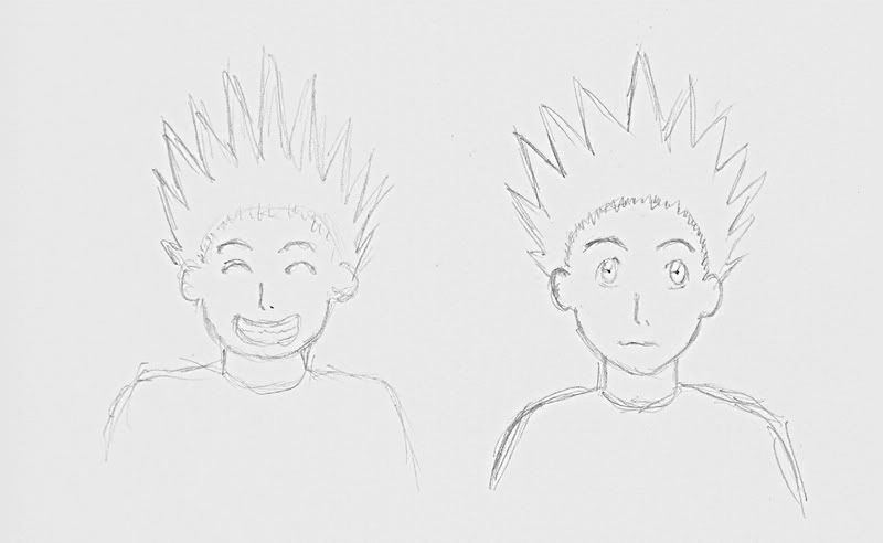
Personality: Quick-tempered, fragile, clusmy, stupid
Rules: Always clusmy and easily offended.
Appearance: A small flying creature that looks like an everyday cuddly toy.
Character Plot: Within its world, Poro encounters a boy falling down from the sky. So Poro appraoches it asking the boy why he is falling from the sky. Poro then took long enough to realize that the boy does not have the ability to fly or any other ability known. Poro ends up saving the boy.
Character Profile 1
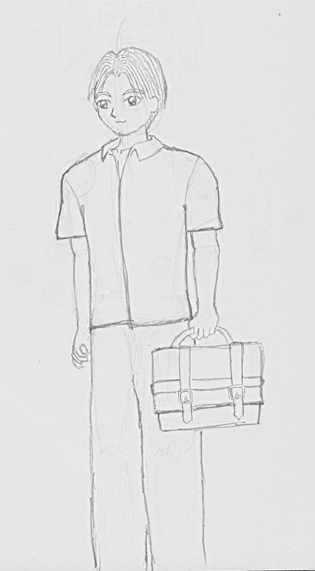
Gender: Male
Age: 16
Occupation: High School Student
Personality: Clusmy, paranoid, friendly, well-mannered.
Rules: Always paranoid.
Appearance: Innocent looking, well represented.
Character Plot: Kace was running late for high school, as he jumps on the train. But as he steps into the train, he steps into another dimension. Paranoid as he is, he gets all worried trying to get out of this world.
Monday, 3 March 2008
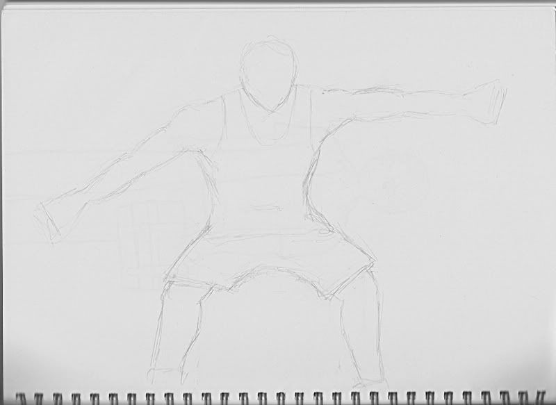
Very random

Not confirmed whether he'll be part of anything yet, but a sketch that is non-fantasy like. Probably something you'll see in daily life (most likely of America and not in Scotland).
A perfect example of being related to my daily life, is the fact the guy is wearing a 'Superdry' t-shirt, I'm not familiar in fashion myself, but in my day-to-day life I see a lot of guys wearing this brand.
And for the baseball bat? Well, I wanted a cool posture, it'll be cool if he was holding a 'samurai sword' (katana), but how often will you see someone holding that in a daily basis? Heh.
Because I wanted to base most things in Scotland, I was going to relate the character with a sport that is easily identified in UK. And in the posture I wanted him to be in, he must be holding some sort of 'club', but however, I couldn't think of anything other than a 'baseball bat' at the time. I could've used either a 'cricket bat' or a 'hockey stick'. But geez, a cricket bat will look soooo "UNCOOL"! Hockey stick.... maybe. Hehe.
I'll post the image up in a moment^^